How important is your insurance agency’s website? Consider the following statistics:
- Nearly 70% of insurance consumers search Google prior to purchasing insurance, and 68% have no specific brand in mind when they begin shopping online. (Podium)
- 91% of commercial insurance consumers are willing to get a quote online. (TransUnion Insurance Trends and 2023 Outlook Report)
- 65% of consumers aged 30-49 bought insurance online in 2023. (Statistica)
Since most of your prospects and clients will interact with your website, it’s critical to the longterm success of your insurance business. However, as the importance of digital engagement grows, so do the expectations on your website.
Is your 24/7 storefront (website) checking the following boxes?
1. Visible – appearing prominently in Google search engine results.
2. User Friendly – easy for anyone to navigate on any device.
3. Converting – designed to turn visitors into clients.
If not, then it’s time to redesign your insurance website.
…Need Inspiration?
Insurance Inbound’s Top Insurance Websites of 2024
1. Next Insurance

At the top of our list of best insurance agency websites, Next Insurance offes users a playful yet informative design with pages for niche insurance products.
What this design does especially well:
- Clear and uncluttered calls to action for specific converages.
- Credibility demonstrated with “featured on” logos and customer reviews.
- Imagery of relevance to target audience.
- Both text and video content.
- Highlighting the ease of their business insurance process.
- Education on related coverages, useful articles, and frequently asked questions written for their target audience.
- Promoting their mobile app.
2. NJM Insurance

NJM Insurance offers a no-frills yet comprehensive website experience.
Why this is a great insurance website design:
- Relevant imagery for specific product and service pages.
- Immediately establish the brand experience with their “No Jingles Or Mascots – Just Great Insurance” tagline.
- Emphasize both in text and with imagery the geographic markets they serve.
- Highlight credibility through real customer reviews and awards.
- Distill a lot of information into easily digestible content.
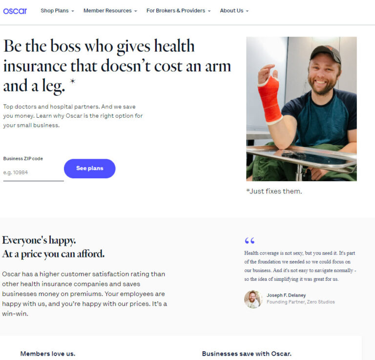
3. Oscar Insurance

The Oscar website offers a clean user experience with creative layouts and engaging visuals.
What this website design does especially well:
- Simplifies a lot of information into easily digestible content and imagery.
- Establishes its brand as superior to competitors with comparison charts, customer reviews, statistics, and win themes.
- User flow is both natural and highly engaging.
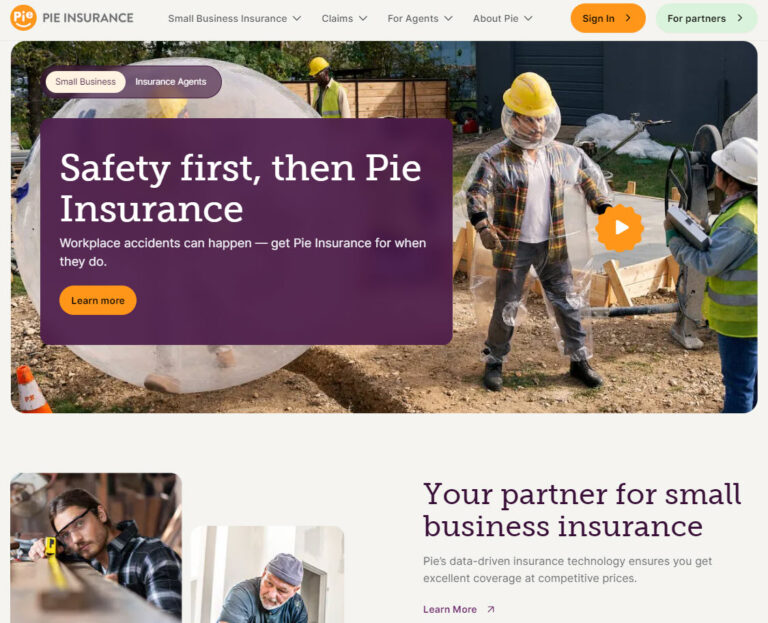
4. Pie Insurance

Pie Insurance stay true to brand with a website experience that is built around an easy user experience.
What this insurance website design does especially well:
- Super clean design that’s easily navigated.
- Highly visible value propositions with simplified language and visuals.
- Additional resources and information are accessible on any page from formats that don’t clutter or overwhelm the user experience.
5. Goosehead Insurance

Goosehead Insurance offers a clean website design that carries their brand consistently through each page.
Here’s what this design does especially well:
- Smartly branded visuals of relevance to target audiences across product pages.
- Emphasizing customer reviews to establish credibility.
- Succint and relevant content displayed in various formats keep users engaged.
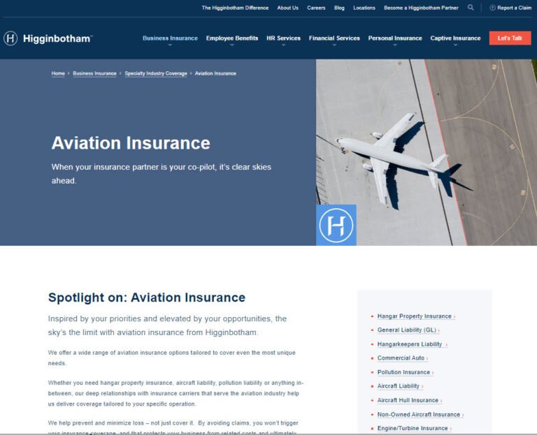
6. Higginbotham

The website for this independent insurance brokerage is enormous and extensive, but the design and site architecure create a user-friendly path for visitors to navigate to relevant information for their specific business needs.
Here’s what this design does especially well:
- Efficient and user friendly navigation.
- Wide range of specialty industry coverage pages that are heavy with details but still easy to navigate.
- Smart use of highly relevant testimonials, video, case studies, and visuals throughout coverage pages.
- Effective use of sub-navigation within lenghthier pages to help users immediately find the information they are most interested in.
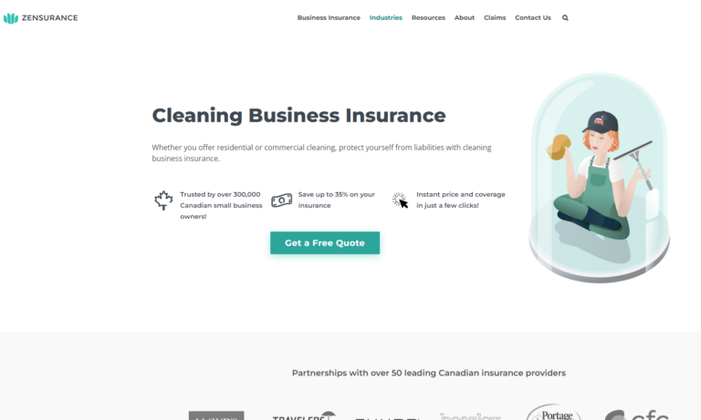
7. Zensurance

Zensurance offers a clean design with smart use of whitespace to ensure the user experience is not overwhelming, true to it’s brand.
Here’s what this design does especially well:
- Succinct navigation with a focus on industry-specific pages.
- Smart use of expanding content to allow each page to accommodate a lot of information without visually overwhelming users.
- Including industry-specific common claims scenarios to increase relevance and authority.
What's Your Next Move?
If you’re ready to take your digital presence to the next level, contact us about redesigning your insurance website.
Already have a shiny new website, but want to accelerate performance?
>Learn more about search engine optimization or consider a lead generation campaign.
